Skip to main content
Interpreting the results
How to read a histogram

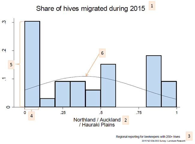
- This figure shows the share of each beekeeper’s hives that were migrated during 2015.
- It focuses on beekeepers who are in Northland, Auckland, and the Hauraki Plains…
- … who have more 250+ hives.
- The x-axis shows breaks the share of hives that each beekeeper migrated into groups (0-10%, 10-20%, 20-30%, etc.)…
- … and the y-axis shows the share of beekeepers who fit into each group.
Thus, about 30% of the beekeepers with 250+ hives in Northland/Auckland/Hauraki Plains migrated 0%-10% of their hives.
- The normal distribution curve highlights the average: The peak of the curve is about 40%, indicating that…
… The average beekeeper with 250+ hives in Northland/Auckland/Hauraki Plains migrated 40% of his or her hives in 2015.

