1.1 Interpreting the results
The results are posted as pie and bar charts, histograms, and box-and-whisker plots.
How to read a histogram

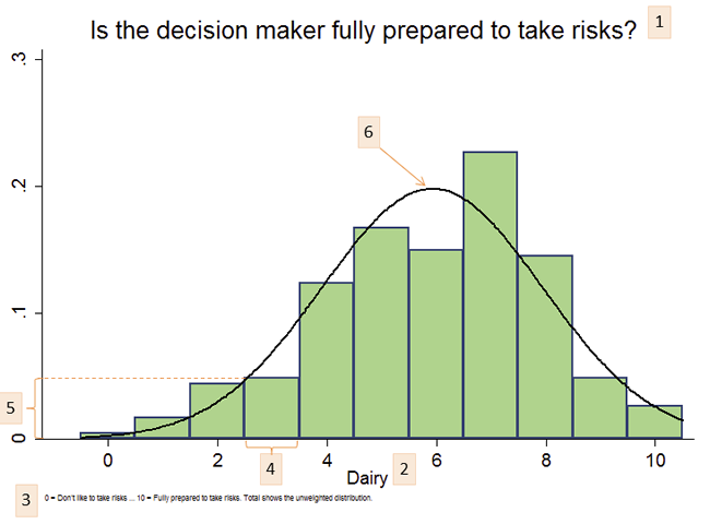
- This figure shows responses to the question “Are you fully prepared to take risks?”…
- … among dairy farmers who responded to the survey.
- Notes help to interpret answers. 0 means “don’t like to take risks” while 10 means “fully prepared to take risks”.
- The x-axis shows the range different answers: 0, 1, 2, 3, 4, 5, 6, 7, 8, 9, and 10.
- … and the y-axis shows the share of respondents who gave each response.
Thus, about 5% of the dairy farmers in the survey responded “3” to the question “Are you fully prepared to take risks?” - The normal distribution curve highlights the average: The peak of the curve is about 5.9, indicating that…
… The average response among dairy farmers in the survey is 5.9.
How to read a box and whiskers plot

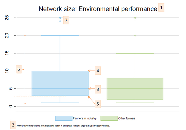
- This figure shows the size of networks used to discuss environmental performance of the farm.
- … among respondents who met with anyone regarding environmental performance.
- The thick line in the middle of the box indicates the median: 50% of farmers who met with others talked with 5 or more other farmers in his/her own industry, and 50% met with 5 of fewer. The same is true for farmers in other industries.
- The top line shows the 75th percentile: 25% of farmers talked to 10 or more farmers in his/her own industry. Similarly, 25% of farmers talked with 8 or more farmers in other industries.
- The bottom line shows the 25th percentile: 55% of farmers talked to 3 or fewer farmers in his/her own industry.
- These bars show are calculated as 1.5 times the interquartile range.
- Outliers (extreme values beyond 1.5 times the interquartile range) are shown with small x’s:
Some farmers met with as many as 25 other farmers in his/her own industry.
